Clothes store giant Gap knew they were heading down the wrong direction, when they introduced a new corporate logo last week.
It was rather obvious that the choice of corporate branding was not only rushed and unnecessary, but it also reeked of amateur qualities unbefitting of the established clothes brand.
The backlash was substantial but still, Gap refused to budge.
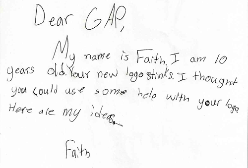
It wasn’t until a letter from a young girl arrived at the Gap headquarters, clearly demonstrating the madness that had overcome the creative department and the upper management, who had approved that eyesore of a new logo.

Faith's letter to Gap triggered the return to the old logo
Faith’s letter to the Gap read as such:
Dear GAP,
My name is Faith. I am 10 years old. Your new logo stinks. I thought you could use some help with your logo. Here are my ideas.
Faith
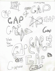
The letter came along with a number of hand-drawn variations of what the Gap logo could look like, from the perspective of a 10-year old.
Faced with such candid honesty, the creative director for Gap announced Monday that they will be holding a meeting to discuss their options.
Sure enough, Gap ultimately decided to revert to their established old logo!
Marka Hansen, president of Gap North America, said in a statement Monday that Gap is reverting to its original blue box logo on its website and will bring it back across all channels.
Thanks to Faith’s letter, the world is now a better place. Until the next creative madman comes along.


Really nice story (if it’s not a fake 🙂
AFN – The letter and drawings are very real.