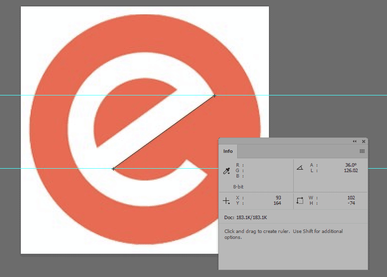
Domain registrar eNom launched its rebranded web site yesterday, sporting a redesigned logo with a spiffy, angled “e” letter.
As one can see in the detailed scheme below, the exact angle of letter “e” is set at precisely 36 degrees off the X axis, and despite some rumors about its intentional, esoteric meaning, we were told otherwise.

The new eNom logo, angled at 36 degrees off the X axis.
Indeed, it was a freak car accident that generated this masterpiece of logotype goodness:
“Our designer, Jerry Peexul, had created the final draft for the logo, using the standard process for composing the graphical elements: paper, crayolas, scissors and Elmer’s glue,” said Matt Overman, VP & GM, Aftermarket and Premium Domains.
“Unfortunately, on his way to the Rightside offices, he had a car accident – a minor fender bender, luckily – and that was it, things changed.” added Overman.
Apparently, the collision’s impact shifted the design’s items at a random angle, resulting into the new eNom logo as we’re seeing it today.
“Everyone loved it, we told Jerry not to fix anything, it looks great!” exclaimed Matt Overman.
The new eNom logo is already being used at corporate parties by Rightside, as we can see in the photo below.
Matt Overman is the tallest guy in the room. We don’t know who is Jerry Peexul, to congratulate him.

Domain rebranding: Rightside / eNom party.


warm colors , more clean and dynamic 🙂 maybe more orange colors ?
Needs more cowbell!