At Uniregistry, it’s all about pixel perfection; like everything else that comes out of the Frank Schilling stable of companies, nothing is finished until it’s 100% perfect.
“We pondered on our Uniregistry logo over the past three weekends, and the general consensus was that there was something missing,” said Frank Schilling, clicking on a high resolution PDF file containing the new and the old logo.
“The new design sports a bigger, longer ‘U’ that clearly demonstrates this domain registrar is about you, the customer, the client, the domainer. It’s now perfect, I love it, it’s sexy!” exclaimed Frank Schilling.

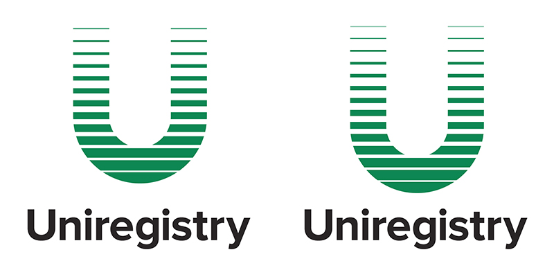
The old Uniregistry logo (left) and the new Uniregistry logo (right)
Indeed, the new design is several pixels taller, with an added green line across the top of the “U” letter; the extension reaffirms Uniregistry’s commitment to great user experience.
“Most designers absolutely hate becoming ‘pixel pushers’, but this is a job that here at Uniregistry anybody would love to have, we’re a few pixels away from the Cayman beach!” said Frank Schilling, laughing out loud.
The new Uniregistry logo will be demonstrated during TRAFFIC 2014 in Las Vegas, which opens its gates tomorrow.


