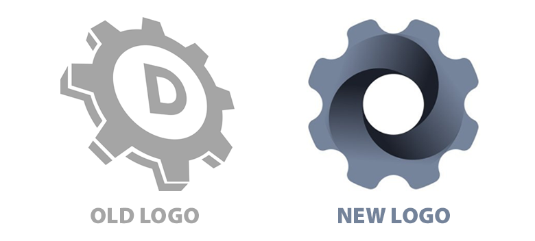
DomainTools has rolled out a redesigned corporate web site, including a new logo, while retaining similar primary brand colors, white and gray.
The new DomainTools.com is fluid and friendly, with a user interface designed for fast access and visual clarity.

Timothy Chen, CEO of DomainTools, noted:
If you’re reading this, I hope it feels a bit new and different. Today we launched a refresh of the DomainTools site and branding and an update to the navigation and hosting platform. Our goal with this effort is threefold:
- Make it easier for visitors to better understand what we do and to more quickly navigate to the content they are looking for.
- Improve the page load speeds and deliverability from all parts of the globe.
- Modernize the DomainTools brand to reflect where we are going rather than where we have been.
We really like the new look of DomainTools and their new, clean “cog” logo! 😀
For the full press release about rebranding from DomainTools, click here.


Was taken by surprise when I visited yesterday. Didn’t know the change was coming. Looks great.