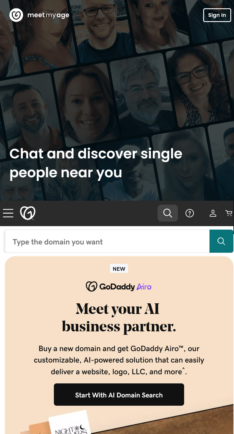


It’s not what it looks like – that’s what she said!
In the case of online branding, similarity can cause confusion. Brands that become popular carry with them the visual constructs of their design and it seems there’s a bit of that with the GoDaddy logo.
Sure, we didn’t like the logo without the “Daddy” at the beginning but what matters is that GoDaddy stuck to it. Introduced 5 years ago almost to the day, the current GoDaddy logo carries with it the letter G nested inside a heart shape.
Here comes a dating app, MeetMyAge and its curly heart logo. Somehow, we see a “G” that’s not too subtle.
Perhaps we’ve been using domain names far too long and GoDaddy has been around for a quarter of a century. It seems that the similarities are too obvious. Now we’re curious about how many domainers could be members there!
What do you think? 🤔