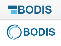
Bodis: The new logo on top.
Bodis, the domain parking company, has been growing in leaps and bounds.
Over the course of this year, Bodis increased the available lander templates, improved on its customer service, and redesigned its web site.
Although we lost the Bodis girls, the web site is a breeze to peruse.
Today, Bodis announced the redesign of its corporate logo; from a swirling circle, to a minimalist representation of the letter “B” using two blocks of color.
Here’s the announcement of the new logo by Bodis:
“Today, we are excited to announce a major change to the Bodis brand. We have revised our logo to better reflect our business offering.
We realize that our past logo has made little, if any, sense for our business, for our users, and to ourselves. Our new logo changes that and helps communicate two key messages about what Bodis stands for.First, we wanted to convey with our new logo that we are primarily a company that focuses on domain parking. We are committed to domain parking, and as such our focus is on developing and innovating software and technology that helps you maximize your parked domain earnings. Therefore, our new logo consists of two bars that show our efforts to improve your earnings and our focus on reporting and software to manage your parking revenue.
Second, we wanted our logo to convey progress. The bars show that we are progressing, moving forward, and most importantly, innovating, in an industry where other companies have stopped innovating or decided to leave the industry altogether. We pride ourselves in being 100% committed to the domain parking industry and we strive to constantly work on improvements and innovations to help please our users.”
We like it.
We also like Lego blocks and anything that looks square and yummy. 😀
For more information, visit Bodis.com.
Copyright © 2025 DomainGang.com · All Rights Reserved.


It would be nicer without “ODIS”