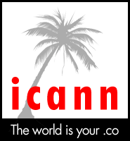
New era, new logo.
Following on the footsteps of WIPO and its redesigned logo, ICANN – the Internet corporation for assigned names and numbers – has just unveiled its new corporate logotype.
The logo sports a palm tree – apparently to emphasize the support of ICANN towards tropic and subtropic locations worldwide, where its lavish meetings are held.
The byline “The World is your .co” emphasizes ICANN’s allegiance to ccTLDs, in particular to the Colombian national TLD .co which will be launched sometime in June.
According to the ICANN press release:
The new logo reflects the Organization’s power in the worldwide domain market, its continuous commitment to local TLDs, and is a dynamic representation of ICANN’s commitment to worldwide traveling and strategic geolocation. The number of leaves (12) on the palm tree represent the principles of ICANN, as set forth in our Book of ICANN ideology:
- Money is power
- Power is good
- See the world
- The world is your .co [sponsored entry]
- gTLDs are good
- Why take vacation when you can work at ICANN
- In domains we trust
- If you type it, we make money from it
- Your ideas – our money
- [entry blank – looking for sponsor]
- [entry blank – looking for sponsor]
- [entry blank – looking for sponsor]
The new logo is slated to appear on ICANN’s homepage later this year, definitely before the upcoming meeting in Cartagena, Colombia.
Copyright © 2025 DomainGang.com · All Rights Reserved.


Lucius,
Could you please move the Palm Tree in the photo just to the right of the last “n” in ICANN?
This way it will look like ICANNT which is really what the new logo should say.
Thank you.
Tricolorro – please don’t confuse ICANN which is a truly ethical service for the domain community, with ICANNT.com.
Those bastards at ICANNT.com are known procrastinators with no interest in progress whatsoever. Whatever you do, don’t visit ICANNT.com
Idiots.
They still misspelled iCONNED.
lol
“Whatever you do, don’t visit ICANNT.com”
Okay i WONT!