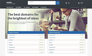
Sedo 2016.
Sedo has gone through several transformations of its web site through the years, and last year it won the DomainGang UX / navigation interface award.
A newly designed portal was unveiled today, focusing on an improved presentation of domain inventory, along with mobile-friendly layouts.
Currently, we are still perusing the changes, and we were given access to a Sedo document (PDF) that was used internally to identify the key points that were changed or improved in this redesign.
The key points of the redesign, as described in this Sedo document are:
- Responsive web design
- Modernized look
- Search interface improved
- Menu navigation is now much more concise
- More detailed copy; better guiding new users through the process of buying a domain
- Simplified approach for new account registration; allowing for expansion of potential buyer pool and inreased seller satisfaction
Domain marketplaces such as Sedo, go through extensive research to ensure the user experience and flow of navigation assists customers eager to spend money on domains.
Hopefully, in our next 5-way comparison of domain marketplaces, Sedo will again rank as high as it did in the past! 🙂
 Loading...
For now, domain investors visiting Sedo.com will need to get accustomed to the new look and feel, which will be used for a while – until the next redesign arrives. 🙂
Copyright © 2025 DomainGang.com · All Rights Reserved.


