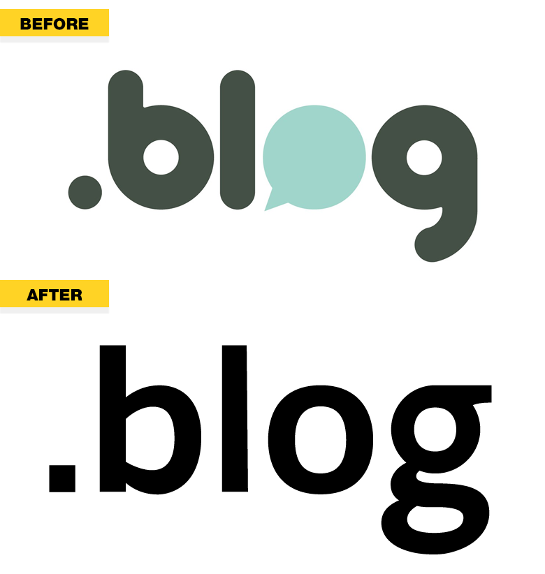
Dot .Blog, a new gTLD operated by Automattic, has revealed its latest creative redesign.
Dropping a logomark that was donoughty but efficient in delivering the message, dot .Blog adopted a non-stylized textmark.
“The new look is courtesy of Chris Runnells and Kjell Reigstad of the Automattic design team, the folks behind design.blog.
We’re excited to launch this new look and feel it is an excellent representation of our focus for the year to come. Straightforward, streamlined, and, as always, putting bloggers first.”
Google-inspired Automattic is known for its visual minimalism, but this latest brand redesign exceeds anything we’ve seen before.
It’s not an early April Fool’s joke either, so check out the before and after pictures below, and visit Nic.Blog.


I guess the new logo is clearer with a regular “O”. The “g” at the end reminds me of Goog*e.