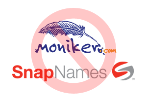
Moniker and SnapNames debranded

Moniker and SnapNames have been debranded.

“Shock and horror” are words that can be used with regards to the latest debranding of major registrar and drop-catching/auction house, Moniker and SnapNames respectively.

The newly redesigned child companies of Oversee.net have lost a lot of their pieces of flair, by dropping their characteristic logos that kept the brands distinct for several years.

“We thought it’d be a great idea to take the beautiful Moniker quill and the bold SnapNames logo and toss them to the virtual garbage”, said Marcus Aurelius, chief developer for Oversee.

“Who cares about brands anymore when we have a monopoly in the market, plus Oversee will now be the only company in our corporation with an almost decent logo”, he added.

The days of investing in branding are apparently gone for the domain industry. More domain developers prefer the textual representation of their company name, using either Helvetica or Times New Roman; often times without even bolding the font.

“I lost all of my domainer clients because they don’t want a logo developed anymore”, said Tarc McGard, a designer from Leeds, UK.

“Those cheap bastards just use text and avoid all graphics like the plague! It’s the new trend, apparently, but I’m just about to go get drunk at the pub”.

Known for being penny-pinchers, domainers are taking a low-budget approach to all things related to domain development; often times resorting to faux development such as the ones provided by Septik Corporation.

Copyright © 2024 DomainGang.com · All Rights Reserved.

Comments

5 Responses to “Moniker and SnapNames debranded”
  1. David says:

    On a serious note, I must say I like the old site better in a number of way, including easier navigation.

    First and quite strangely, the good looking and well known Moniker Quill Logo is gone which seems real odd since it was nice branding with a cool logo, and been around for many years.

    For some odd reason they also removed the quick registration link which was a popular feature on the old site. Easy bulk reg is there but the much more popular single name quick reg is gone.

    Also don’t like the light gray text color which is hard to read vs the old black text.

    Another important missing feature missing is before if you added the extension to the initial registration order the next screen would only register that exact domain but now if you enter the extension it makes no difference and you are required to indicate the extension again and uncheck the many unwanted extensions on the next screen which is double work and a slower process.

    One more issue is the space allowed for the URL on the shopping cart checkout page is too small which means long-tail domains have the right side or the extension chopped off so you are not sure if the domain being registered is the right one or maybe an error.

    And with the old site if the name you wanted was taken there was a place to quickly check the Whois right next to the taken name which is now gone and requires you go to the main menu and click on whois and re-enter the url again.

    Plus the top to bottom order of the available extensions for registrations is always random or nonsensical with them arranged in different orders each time you visit the reg page, which is weird seeing it differently each time. and makes errors more likely.

    Just my 2 cents on the site upgrade. All these things are quite negative overall for the new website.

  2. Lucius "Guns" Fabrice says:

    David – thank you for your lengthy, useful post. While the logo change is just part of the problem, it’s still odd why Oversee took away the brands like this.

  3. John Martel says:

    I thought I some how ended up on the wrong site for a second. I can totally understand, (though disagree with) using a text logo if you’re tossing up a bunch of automated web sites… but here are two popular web sites with real and recognizable logo’s and they change to some lousy text?

    OK, maybe a quill is a bit dated, but it stood out and people got it. This is a FAIL in my book. Then a big ditto on what David said.

  4. Lucius "Guns" Fabrice says:

    John – Hence the “debranding” reference. It was a strip-down beyond any necessity, in my opinion.

  5. Hal Meyer says:

    Yes, Moniker was debranded, and it might also have been “neutered,” by its new owner, Oversee.

    In my opinion, this action to destroy the excellent logo and branding gives additional credence to Monte Cahn’s recent lawsuit.

Leave a Reply

Your email address will not be published. Required fields are marked *

 characters available