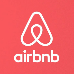
The new Airbnb logo.
Airbnb, the online rentals business has released its new brand – and it literally looks like a load of bollocks.
The triangular shape dubbed “Bélo” is a shorthand for “belong”; part of the Airbnb culture of sharing space when traveling.
The explicit curves of the new logo reference human genitals, both male and female and the entire issue could have been avoided by introducing some minor adjustments.
Some find the Airbnb logo to be phallic, while others say that it looks like a vagina.
Meanwhile, Airbnb released a video explaining the design behind its new brand and hopes that very soon the matter will be forgotten.
Anyone else remembers the Gap gaffe?
Copyright © 2025 DomainGang.com · All Rights Reserved.


