An intuitive article on conference badge design, by Richard Lau, founder of NamesCon.
Copyright © 2025 DomainGang.com · All Rights Reserved.Richard Lau, founder of NamesCon.
Last year about this time I wrote an article about designing a great conference badge.
I have been to many conferences since, and thought it would be useful to discuss some of the larger conferences that have, in my personal opinion, failed their attendees or their sponsors in some fashion.
Not intentionally, not maliciously, just not paying attention to the details.
The Font Size
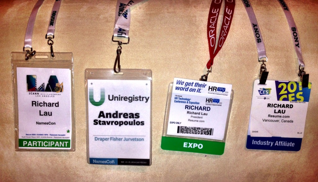
Ok, this is fully covered in my original article so I’ll keep it short and sweet. The first name and the company name should both be easily readable at 8 feet away. And by easily, this means when the badge is on a moving body and your eyes are blurry. Most badges fail these two tests. ICANN succeeds with the Attendee Name, but just slightly fails on the Company Name. CES and HR Tech both fail on the company name.
The Badge Sponsor
You know what conference you are at, so does everyone else you meet. So the Logo of the conference is a waste of real estate. Slide it to the top corner, or better yet to the bottom of the badge. And promote a sponsor, and make sure it is an industry leader. You are tying their goodwill with that of the conference. Having a Badge Sponsor of a small company means you are a conference with a small vision and appeal.
Having a Badge Sponsor, like Uniregistry, displays that you share common vision, common goals and shared goodwill. You must be proud of the Badge Sponsor, since you are asking every attendee to display that logo out loud, on top and out front.
We love Uniregistry and we show it. They are a thought leader, and I would proudly ask my mother to wear their logo if she came to the conference.
And for goodness sake, clean it up people. There’s no need for tiny text, repeated wording, repeated names. I mean, is my name Richard Richard Lau? Drop the title, and just focus on the person’s name and company. If you need to know their position, bring that up in conversation. And geography? Where am I from? Is it where my business is located, where my head office is, where my home is, or the airport lounge? Does it really matter? Putting all of these items on the badge space detracts from the Attendee Name, their Company Name and your Badge Sponsor logo.
We hope we have served our Attendees well, and we believe we will deliver value to Uniregistry in their logo on 800+ badges, double-sided of course.
The Lanyard
In many cases the lanyard is viewed as nothing more than a string that you balance between a thick width on which to display your “Lanyard Sponsor” logo and cost – as cheap as possible. In reality, the Lanyard is one of the top two logos seen at any conference, and is carried on in perpetuity in photos distributed throughout the Internet pipes on such small sites as Facebook, Twitter, Flickr and industry blogs.
The width is important for two reasons: firstly, attendee comfort. A wide lanyard that is also made out of soft silky material will not fatigue the attendee after a few hours of wear. Remember, as a conference producer you are asking your attendees to wear this personal item next to their skin, under their hair, around their sensitive neck for upwards of ten hours a day for three or four days in a row. Comfort is paramount.
Secondly, a wide lanyard is real estate for the sponsor’s logo, who, let’s face facts, is putting out the money for the extra wide, extra soft, ultra-comfortable lanyard. And don’t skim on the printing – be sure to print on both sides of the lanyard. Three out of the four used double-sided printing, and while the single-side printed lanyard was soft, it was too thin to be as comfortable as the wider soft versions. And the Oracle lanyard provided at the HR Technology Conference was wide, which was great for Oracle, but felt like rope and I saw people taking it off literally as soon as they walked past security.
Fail. If you, as a supplier, aren’t willing to wear your lanyard for 24 hours straight, don’t ask you attendees to wear one for 8 or 10 hours a day. Our Lanyard Sponsor is Afilias, and they insist on supplying their lanyards to us. I can see why: soft, wide, AND it has something I have yet to see this year on any other lanyard…. an easy on/off clasp at the back so that you don’t have to pull the lanyard over your head to take it off. Something those of you with longer hair will appreciate. It’s the details that count, especially on an up-close and personal sponsorship item. Hats off to Afilias for the best lanyard I’ve seen at any conference. I’m especially glad to have it as the lanyard on which our Conference Badge is attached.
The Clasp
Double-clasped lanyards attach to the badge holder with two clips as seen in the CES badge and the ICANN badge. Single clasped lanyards attach in the center and allow the badge to spin or flip.
The goal of the double-clasp is to try and ensure that the Attendee’s Name is always facing forwards. The CES badge does a decent job of this by having the clasps on the far corners of the badge holder. However, if the clasps are attached too closely together (as with the ICANN badge holder) the badge still flips over and you are left looking at the fine print of the Schedule and where the First Aid Station is located. The worst is when you have a center clasp and a name badge that is printed on one side. You have a 50% chance of showing your name, and a 50% chance of showing the back of the name badge.
The HR Tech Conference was a crap shoot for introductions. After a while you just stopped looking since the fail rate was 50% and it was embarrassing to be caught looking and still coming up with no name. So, what is the logical choice? It seems simple enough….. print the Attendee Name on the front AND on the back. Use the center clasp, or double-clasp, but either way, make it easy on all attendees stumbling for a name and just print it twice. The front is the back is the front. Attendee name, attendee name, attendee name.
That’s what the attendees wear their name badge for. It’s nice to be in a place where everybody knows your name. The cost of double-printing is, well, double, but isn’t your attendee worth it?
Size Matters!
A conference is about networking. Networking for dogs is about sniffing.
Thankfully networking as humans starts with a name. Take a small badge, double the size and you will double the amount of socializing and networking going on in the lobby and common areas. And for old dogs like me who can’t remember the name of their own kids, let alone a walking email acquaintance you haven’t seen in a year, it’s embarrassing for all parties when a name is forgotten or misspoken. Make it easy on everyone.
Big. Name. Name. Big.
We use a 4″ wide by 6″ tall format. Sure it’s the most expensive set in the catalog, but it’s worth every penny.
Running your first conference and need to use a tiny badge? Then drop the logo, drop the conference name, drop the Attendee’s company name, even drop their last name. But be damn sure their first name is easily readable, on both sides of their name badge, from 8 feet away. If you can’t do that, please… don’t stay in the conference business.
Come to NamesCon and check out our badges. As you might be able to tell, we’ve spent dozens of hours sweating over the details. It’s what we do to ensure that our Attendees and our Sponsors receive the best networking experience possible.








This would be just like the conference- update for today’s generation http://www.springwise.com/smart-conference-badge-replace-business-cards-brochures/