We’re all excited to be attending NamesCon in Las Vegas, the biggest, newest domain conference of 2014.
In a guest article, NamesCon founder, Richard Lau, explains the process that takes place when designing an attractive badge for those that attend.
Copyright © 2025 DomainGang.com · All Rights Reserved.One of the things that you may see all the time and not put a second thought to when you are attending a conference is the conference badge itself.
But for some conference attendees like myself the conference name badge can be a painful point of contention. Matt Cutts and Mike Davidson have covered this topic in detail in their articles here and here. I especially like Matt’s back of the napkin doodle drawing!
Matt Cutts’s main point is simplicity and ease of readability. One of his ideas is for a name badge to measure 4 inches tall by 6 inches wide – kind of like a postcard.
I like the idea but strangely, conference name badge suppliers do not make that size. Instead the largest standard size is 4 1/4 inches wide by 6 inches tall – similar real estate but vertically oriented.
What font?
The font that should be used is an oft-discussed and hotly debated topic amongst designers. Should the font match the font used in the conference name/logo? Or should readability from a distance usurp all other design questions? We followed Mike’s advice and went with a phone that was recommended in his article: Interstate Black Condensed.
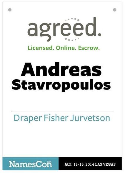
And since this is a conference that is supported by sponsors, as most conferences are, we prominently display one of our main sponsor’s logos right on the name badge itself. This is in addition to the sponsored lanyard that is attached to the name badge holder. And speaking of the lanyard – we are going with a double-ended lanyard that will hook into the top two corners of the name badge holder. This will prevent the name badge from twisting around, and could free up the back for something else.
You already know what conference you are at and what dates those cover so that information, while included, is in a less prominent position at the bottom of the name badge.
The First and Last name are on separate lines. That’s self-explanatory, but you would be surprised how many conference organizers get that wrong. And I’ve noticed a lot of people put their business card in their badge holder. We have placed a horizontal line 2.1″ from the bottom with the attendee’s company name below that line. If they choose to, they can place their business card horizontally at the bottom of their name badge, without covering up their name, nor the sponsor’s logo.
Additionally, and perhaps radically, we have dropped the designation of the wearer. In a large conference I can definitely see the value of separating exhibitors, sponsors, speakers, buyers, volunteers, staff and attendees. However in a conference that numbers less than 500 attendees I vote for equality amongst all. Dropping the label encourages more social interaction. And it dispenses with any elitism.
Take a look at our design that we are moving forward with for NamesCon Las Vegas 2014. Until it hits the printer’s press, changes can still be made. Don’t be fooled by the simplicity – dozens of hours have gone into this name badge design by myself, staff, advisers, and our design contractors at iStaff.ph.
Our checklist:
- Make it big, 4.25″ wide by 6″ tall is the largest we could find.
- First name on a separate line from the last name
- Use a readable font; readability usurps design
- Placement of horizontal line and company name 2.1″ from the bottom
- Name of the conference & dates take a less prominent position
- No designation of “rank” or “class” of wearer; only recommended for small conferences
- Double-ended lanyard to attach to the two holes in the top corner of the name badge holder to keep the badge from twisting around.
- Lanyard to contain a sponsor’s logo. Could be the same as, or different from the Name Badge Sponsor.
The end result can be seen below.
Any other thoughts? What have you liked or disliked about the name badges at past events you have attended? Leave your comment below.NamesCon badge.


Great thoughts and ideas Richard.
Make them double-sided, because they tend to flip over.
Must have skipped over the ‘double ended’ lanyard – that’s another option of course.
At a recent conference they put the schedule on the back of the badge which was pretty handy
Double sided if they turn around easy. ICANN always has the names on both sides. They print it twice put them back to back.