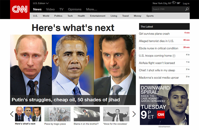
Bodis wasn’t the only one that got a makeover; CNN.com went live with a fully restructured news portal, both visually and in terms of context.
The spacious layout puts emphasis on video and images, in a world that demands its news to be delivered in short, meaningful chunks.
By creating a CNN account, the content can be customized to suit one’s particular interests and needs.

iReport, the user-submitted content provided on the domain iReport.com – sold to CNN by Rick Schwartz – has received a visual update as well.
Overall, it’s a pleasant, easy to read redesign for one of the oldest news portals on the Internet. We give it 5 stars!
For a list of changes to the CNN.com content click here.
Copyright © 2025 DomainGang.com · All Rights Reserved.


I think the CNN redesign truly stinks. 1*. It reflects the further dumbing down of the news, rather than improving the ability to scan for things of importance. They have been chasing Huffington post lately, and I think this just continues that trend. Pictures, video and no content.
Best in class these days is google news, IMHO. It’s simple, scannable, and not cluttered with images that take you nowhere.
“Less than impressed” – This video came to mind 😀
https://www.youtube.com/watch?v=pWdd6_ZxX8c
I have to agree with “Less than impressed” – Cnn has become all show, no reporting. I hope the place burns.
Bob – So you dislike CNN and wish them to burn down? That’s highly immature. Do you think Fox News looks better? They copied after CNN’s previous design so expect them to follow the redesign also. Happy new year.
Looks like it was made for Romper Room, takes forever to load, bunch of garbage pictures, EPIC FAIL. Infotainment crap
David – Get yourself off dial-up, that might help.
I used to go to CNN.com way too many times per day. Fortunately for the redesign, i will not be visiting the site anywhere near as much. Thank you for fixing my addiction by offering a site with overwhelming pictures, so large, i can count nose hairs. And, thank you for leaving off more content so i have less articles to want to click. I am feeling better and will be more productive. This is how i feel about the site, unless there is another version they can offer that is more streamlined.
Jeff – The same was said about every major portal redesign, including Facebook. People hate change. Did you make a CNN account yet? You can customize your feed.
I will give the customized idea a shot, thanks. I know people hate change. i love it when it improves the prior experience. Like larger cell phone screens- i waited until one came out with stylist. It was not Apple. And yes, new can take time to get used to, so i did not rant the first time i saw new CNN. But after repeated visits, i am still get this overwhelming feeling combined with a sense of loss of content. Let’s see what customization will reap. Thanks again.
Yes – the best thing about this redesign is the hours I will save never going to CNN.com again.
The redesign is unusable bordering on hostile on a laptop. This cannot have been tested properly. Plus, I have FIOS, and it’s ridiculously slow to load, extremely sluggish in both Firefox and Chrome. I don’t hate change… I’m a web designer with several revamps under my belt, but this is bizarre.
Jeff, you accurately summed up my same feelings about the new design.
I was also reading articles on CNN a few hours a day. What I really enjoyed was the ability to quickly skip past the garbage and read articles that were interesting to me. It’s almost impossible to do that after the new design. I certainly don’t want to spend 10 minutes scavenging through giant images just to find a list of headlines.
I’ve shifted to Google News & Reddit for most of my news and browsing time.
The redesign of CNN.com has increased my daily number of visits to the portal. I am really happy it got modified.