For real, this time: DNForum has a new design, brand and logo.
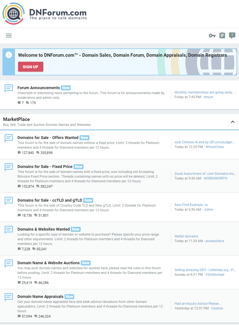
Also known as “skin,” the domain forum layout favors light colors, and the ability to display more content on screen.
The new logo can be seen below:

Here’s the new DNForum layout, which has been activated for all visitors and members:

DNForum.com changed hands last month; the financial details of that transaction were not disclosed.
The new owners of DNForum promised to make both functional and aesthetic improvements, and this is an example of the latter.
Founded in 2001, DNForum is the oldest active domain name forum.
Long live the new DNForum – let’s focus on business! 😀
Copyright © 2025 DomainGang.com · All Rights Reserved.


It needs more dark color in the header and right sidebar. I like a light background but in this case it’s a bit much.
Skin aside, from the sheer lack of responses to the other topic about dnforum it is clearly obvious they have a long way to go to rebuild their reputation. With so many shenanigans from the previous owners I don’t envy the task but it seems like they have a good team and I wish them well. However it will take a lot more than a new skin and logo to rebuild it into what it once was.
MapleDots – AFAIK the new owners have quite the thick skin.
I just came across this logo
http://www.canada.com
Very similar design structure….. there may even be a debatable trademark issue