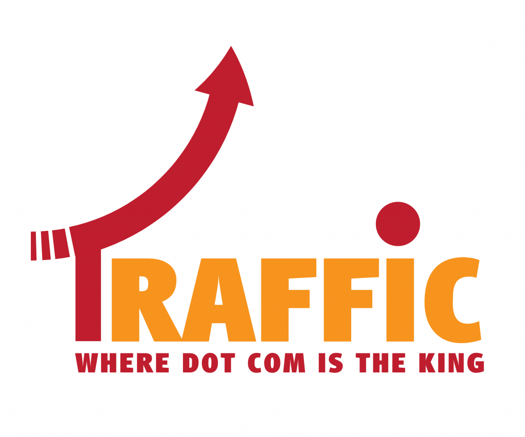
The new TRAFFIC logo.
In a quiet ceremony in South Florida, Rick Schwartz revealed today the new TRAFFIC logo, which replaces the one used for the past decade.
A visibly emotional Domain King, revealed his plans for TRAFFIC Miami 2014, marking ten years of the successful domain conference.
“Folks, today we’re looking upwards and onwards, it’s been a remarkable 10 years of the most amazing gathering of domainers ever imagined. It is time to show that proudly, with our brand, and a new logo was designed for this purpose,” said Rick Schwartz, pointing to a projected image of the new TRAFFIC logo.
Long associated with “Targeted TRAFFIC“, the new design incorporates several messages to the domain community that the domain conference embraces:
- Upwards and onwards, displayed by a stiff red arrow symbolizing masculinity, virility and financial prowess.
- Commitment to a single “Dot” – the dot com – as emphasized by both the red dot and the motto, “Where dot com is the king”.
- Colors that reflect a departure from the monochromatic 2000’s and onto the brand-aware 2010’s.
Rick Schwartz continued thus:
“Initially I had no plans to change the logo but I received a lot of feedback from people saying that the multiple dots hinted of secret support to the gTLDs. Also, the arrow kinda lacked vigor, so we changed that as well!”
Those of you that want to see the new TRAFFIC logo in action, should register for TRAFFIC Miami 2014 before the price goes up.
Congratulations to Rick and his design team for rolling out the new brand!
Copyright © 2025 DomainGang.com · All Rights Reserved.


I’m looking for a logo monitor, like a domain monitor, but for logos. What’s your secret???