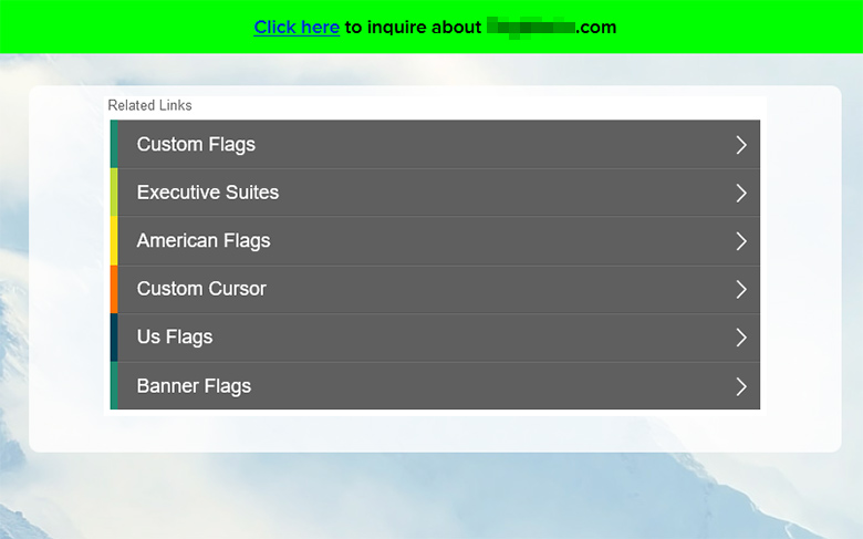
Uniregistry parking landers don’t look as “fancy” as they did a few years ago, but there’s a plan behind that.
Since the acquisition of Uniregistry by GoDaddy, a lot of great things are in the works, and technological know-how has been flowing between the tech departments of both companies.
The recent changes to the Uniregistry parking landers might look subtle: removal of graphic headers across desktop and mobile formats, condensing the links window, and formatting of the links in a way that they appear bolder – similar to what the default GoDaddy lander looks like these days.
All this has a positive effect during the past few days: higher click through rates (CTR) and with that in mind, higher revenue. At least, that’s what we’ve experiencing so far, without an increase in traffic.
In the coming months, the technological exchange between GoDaddy and Uniregistry will continue, with the anticipated release of Afternic 2.0 further down the road.


